
Advanto má novou vizuální identitu. Jejím autorem je agentura Inveo spadající pod investiční fond V-Sharp. Redesign dostal také náš web a reklamní materiály pro offline i online prostředí. Záměrem je vyšší atraktivita, hravost, ale také budování důvěry.
Na webu i propagačních materiálech se změnilo například využití barev. „Na jednu stranu jsme chtěli použít výraznější barvy, na druhou ale budovat důvěru a být i genderově neutrální,” nastiňuje zadání zakladatel a šéf Advanta Martin Fortelný.
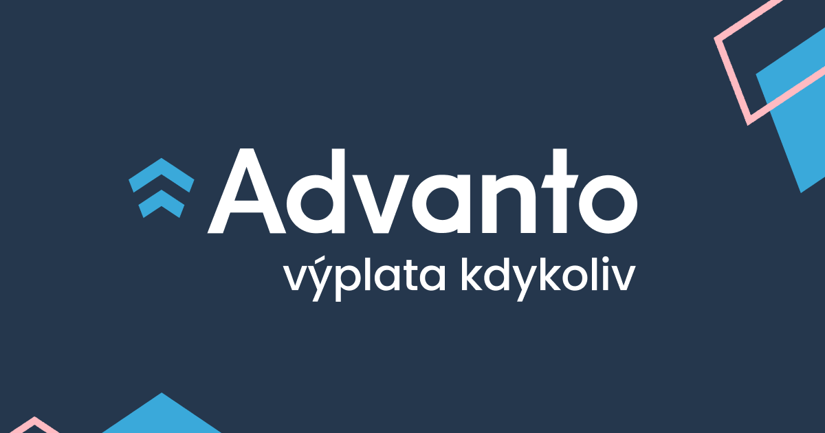
„Zvolili jsme proto kombinaci světle růžové a navy blue na bílém podkladu. Růžová evokuje hravost a navy blue důvěryhodnost, stabilitu a hodí se k finančnímu produktu,” říká k řešení Jaroslav Holý z Inveo.cz s tím, že právě důvěra a bezpečnost je jedna z priorit při tvorbě vizuální identity finančního produktu. „I z toho důvodu se nyní také více pracuje s fotkami lidí,” dodává Holý.
Zásadní změnou rebrandu byla také přeměna logotypu. „Dříve šipky směřovaly dolů. Nyní směřují nahoru, vzhůru, což má pozitivní vyznění. Směr šipek navíc odráží také symboliku vybírání části svých peněz před výplatním termínem. Šipky jsou oddělené a ne celistvé, taky svírají 247 stupňů, což znázorňuje právě to, že si výplatu mohou uživatelé vybírat po částech a taky kdykoliv,” vysvětluje Holý.
Na základě redesignu Advanto modernizovalo také svůj web. „Oproti předchozí verzi je v něm teď plno vylepšení. Kromě vizuální stránky jako zásadní vidím přechod na intuitivní a rok od roku populárnější platformu Webflow, která umožňuje snadno a operativně provádět na webu změny. To je pro startup velmi důležité,” říká UI/UX designér Lukáš Augusta, který má za sebou spolupráce například s firmami Leadspicker nebo Creative Dock.
V novém kabátu jsou také reklamní materiály pro online i offline využití včetně venkovní reklamy. „Fyzické propagační materiály jsou pro Advanto důležité, protože zpřístupnění Advanta ze strany zaměstnavatelů je pouze prvním krokem pro splnění našeho poslání. Potom bývá ještě potřeba o Advantu a jeho výhodách informovat samotné pracovníky, a to fyzicky na jejich pracovišti,” vysvětluje Fortelný.
Nový vzhled značky je patrný i z nedávno vydaného ebooku, ve kterém Advanto reportuje o dopadech výplaty kdykoliv na procesy u zaměstnavatelů i finanční stabilitu pracovníků.
.jpeg)


.png)
.png)
